By Dr. Sami Bahri
A simple first step can significantly boost production
When looking to improving productivity, we often think about low-hanging fruit, like selling more accessory treatments or choosing the right service coding.
The approach is not wrong, but while it improves productivity, it also increases the workload on the staff. In the lean approach, we like to do the opposite. We want to reduce the non-value added work to create more free time for the staff to handle new tasks, like selling more whitening or selling more sealants. To that end, we use a variety of process analysis tools, like diagrams.
The Spaghetti diagram would be a good starting point. It is simple, doesn’t take a lot of effort, yet it will go beyond the low-hanging fruit to the root of productivity improvement.
Why the Spaghetti diagram is so important
At the beginning of the 20th century, dentistry started applying the division of labor created by Adam Smith, the time studies created by Frederick Taylor, and the motion studies created by Frank Gilbreth. That is when the different dental management functions were created – dentist, hygienists, assistant, etc.
Viewed from a productivity point, the division of labor allowed us to treat patients faster – shorter processing time, but created, among others, the problem of transportation. This mainly involves the transportation of patients between different areas in the practice: from the waiting room to the x-ray room, to the treatment room, to the hygiene room, to the treatment plan coordination room etc. There’s the challenge transporting materials to the storage area, then to the work area.
Treating faster makes money, but increased transportation spends it on unnecessary work. That is why in his book Fundamental Principles of Lean Manufacturing, Shigeo Shingo wrote “[I]f the benefits of the shorter processing time (meaning faster treatment) does not overcome the disadvantage of transportation, it is better not to introduce the division of labor.”
The Spaghetti diagram reduces transportation
 Transportation is then the waste we need to remove. The easiest way is to visualize it. That is when the Spaghetti diagram become very important. It is simple, because all you need is a floor plan of your facility and color pencils. With the pencils you trace the movement of either providers, patients, or materials. The resulting tracings resemble what the name suggests, Spaghetti.

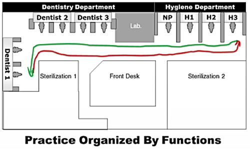
Figure 1: When the practice is organized by departments, transportation increases.
Figure 1 shows us our floor plan when we were still thinking departments. On the left wing of the office, we placed the department of dentistry where three dentists utilized two chairs each. On the right-wing, we had one chair dedicated to new patients and three chairs occupied by three hygienists.
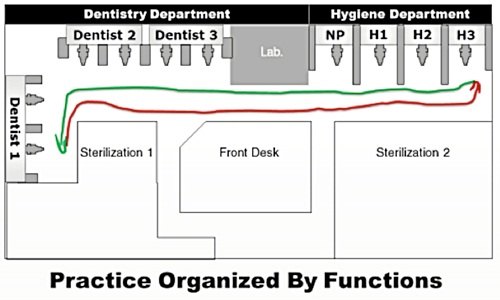
To draw the Spaghetti diagram, we took a floor plan of the practice and followed the movement of the doctor working in Chair 1 when she was called for an exam in Chair 10. The red and the green line show she had a long walk — 110 feet to reach Chair 10 and another 110 feet to go back to Chair 1. This is the simplest form of the Spaghetti diagram because it traces one trip for the exam. Usually, to build a Spaghetti diagram, you trace the movement of a patient or a provider for a longer period of time (see Figure 2). You could trace it for two hours, half a day or even a whole day. It would be even more interesting to trace the movement of multiple employees or patients for a long period of time.
The diagram could look very chaotic, and the need for improvement would become more obvious. One manager in a manufacturing plant in Jacksonville traced the movement of all the employees for one year. “Cumulatively, we walked a full circle around the globe in one year” he commented. Can you imagine how much effort is lost in all that walking?

Figure 2: This is what the Spaghetti diagram looks like when the dentist has to examine one patient in each hygiene chair
Change the layout to reduce transportation
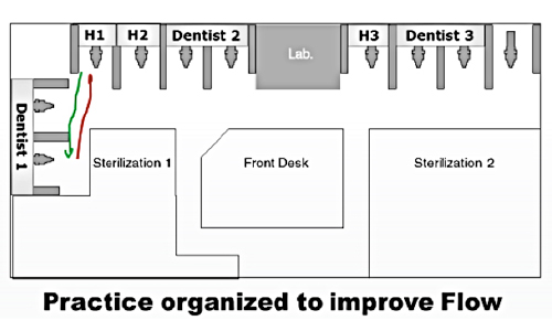
Our goal is to reduce the number and the length of the lines in the diagram in Figure 2. Ideally, we would change the layout of the office to bring Chair 10 closer to Chair 1, but that change would be too expensive. As a compromise, we moved the providers around as shown in Figure 3.

Figure 3: Dentists and hygienists were moved closer together in order to reduce transportation
As you can see in Figure 3, we have moved the providers around to where dentists and hygienists were using adjacent chairs. If you check the lines traced by hand, you would see that the dentist is now walking a total of 20 feet instead of the 220 feet she walked in the first diagram. The savings in walking efforts are remarkable, and they would be even more remarkable if we multiply them by the number of trips to do an exam in every treatment room, as seen in Figure 4. For four exams, the Flow-oriented layout allowed her to walk around 200 feet instead of nearly 800 feet imposed by the department-oriented layout.
Figure 4: When we trace a Spaghetti diagram for all the trips over a long period of time, the need for improvement becomes clear.
Add to that all the trips that could be saved for the rest of the staff, transform those efforts into treating patients instead of walking, and you would see how powerful the Spaghetti diagram can be in improving productivity
Controlling transportation
It is very important to be conscious of the advantages and the disadvantages of every management decision we make. Since we have adopted the division of labor, we need to be mindful that transportation of patients, materials and staff, if not controlled, can overcome the benefits of the shorter treatment times afforded by the division of labor. To control transportation, the easiest way is to make it visible. The Spaghetti diagram is a simple yet powerful tool that allows us to reach our goal. It can be drawn by anyone with very little training and tremendous results in productivity improvement.

